AIWA
Speak Up and Armin Vit pleased me today as they published an article about AIWA new logo.
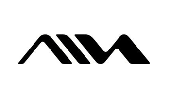
I was strolling along some day in the metro in Paris when I noticed this big ad with a fairly illegible logo. A bit stunned, I had to give a second look to finally spot “Aiwa”. My first thought was that it was pretty unfortunate that one couldn’t even read the name of the brand. And then I though that it was pretty ugly.
The following day, the topic came up in this conversation on one of my favourite forums, Typophile’s. The general opinion was somwhat close to mine. Some of Sony’s logos where shown by Jay Fraser showing the trend in Sony, ligature-wise. All in all, they can hardly be read at all. And yes, I thought it was AIVA.
Three conclusions for myself:
- I’m not as tasteless as I first thought I was: the general opinion of Typophile’s as well as Speak Up’s experts seems to be mine
- Still loooots to learn from people like Typophile’s members
- Christmas is getting close, I’d better hurry up to buy presies, otherwise it’s going to be the usual rush to find anything at the last minute.